Our loyal customers and partners know: PHYSIOMED stands for innovation, for looking into the future and going new ways. We want this not only in our products, but also in our external communication.

In order to remain modern in the design of our communication channels, we have developed a new corporate design that not only looks more modern, but also leads to a better understanding of our content. And that for all target groups.
If you take a closer look at a PHYSIOMED device, you will notice the rounded corners that make up the look of our products. We wanted to reflect these curves in our communication materials as well. Therefore, we developed a new logo that represents our colors in three circles and has a modern and clear look with the straight-lined font:
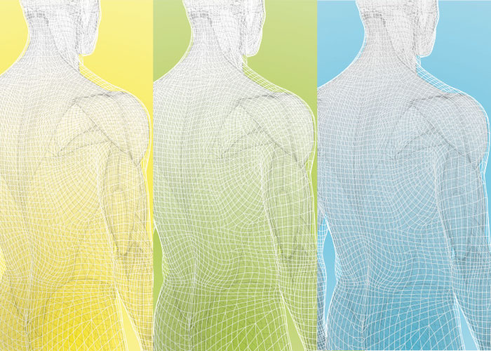
The three colors yellow, green and blue have become brighter and are supported by different shades of gray. Our colors now also have a communicative function: All materials developed for patients will henceforth be designed mainly in yellow with gray and white. Blue will be used for all materials designed for medical professionals with scientific content. Green stands for everything in between.
In this way, we have created a traffic light system that makes it clear which content has been prepared for which target group.
In the coming weeks and months, you will witness how PHYSIOMED is being redesigned piece by piece. Experience us at trade fairs, in social media or even in trade journals in the new design.
A little tip: Come back to www.physiomed.de in the fall. You will discover that a lot will have changed here as well.
We hope you like our new design. If you have any questions, please do not hesitate to contact
Berit Garbrecht
Specialist Marketing
berit.garbrecht@physiomed.de
+49 9126 2587-22